There are plenty of ways within e-Quip to report on events in the past, present and future. The graphical dashboard, for example, can show your current PPM compliance as well as a wealth of information based on a 12-month period, such as monthly workload, parts usage, inventory growth etc. Simple filters can show you jobs planned for some time in the future or work completed in the past. Things get complex when this raw data is analysed and presented as KPIs.
For example, it is relatively simple to determine the current state of PPM compliance by analysing the devices which require planned maintenance and taking into account the service history for each device. This might yield a KPI such, “60% of high-risk devices are PPM compliant”, which is obviously an important piece of information with respect to your current performance.Based on that statistic you might devise an improvement plan with the goal of increasing that figure to 80% within 5 years. In 3 years time it will obviously possible to analyse the current PPM compliance, but what about compliance in the intervening years? In Year 3 will it be possible to recreate the original statistic, not only for Year 1 but also Year 2? This data is clearly necessary to confirm that our plan is working. If the figures for Years 1, 2 & 3 are 60%, 65% & 75% then we can be confident that the plan is working and the situation is indeed improving. Is this kind of analysis possible?
It is true that the records of work done will still exist at some point in the future, but the context that they exist may well have changed. In the intervening years the devices that the work relates to may have been decommissioned; they may have been removed from PPM schedules or might now be serviced at different intervals. They might be serviced by a third party under contract. Many of the jobs themselves will have also changed – all of the jobs which were uncompleted in Year 1 will, since then, have either been completed or closed as “Not Found”. Analysis of job audit records would identify the status of a job on a particular date, but the KPI itself could not be regenerated unless all of the additional contract was also saved. Needless to say, the analysis would be extremely complex.
If historical analysis is not possible, is there is a simpler approach? You could use a notebook and write down every KPI at key dates, then you could look through your notebook to compare historical KPIs. That’s not as far-fetched an idea as you might at first think! Every time you use the graphical dashboard, all of the supporting data is written to the database. That includes all of the data used to plot the graphs, draw the pie charts, show the gauges etc.
Dashboard Snapshots
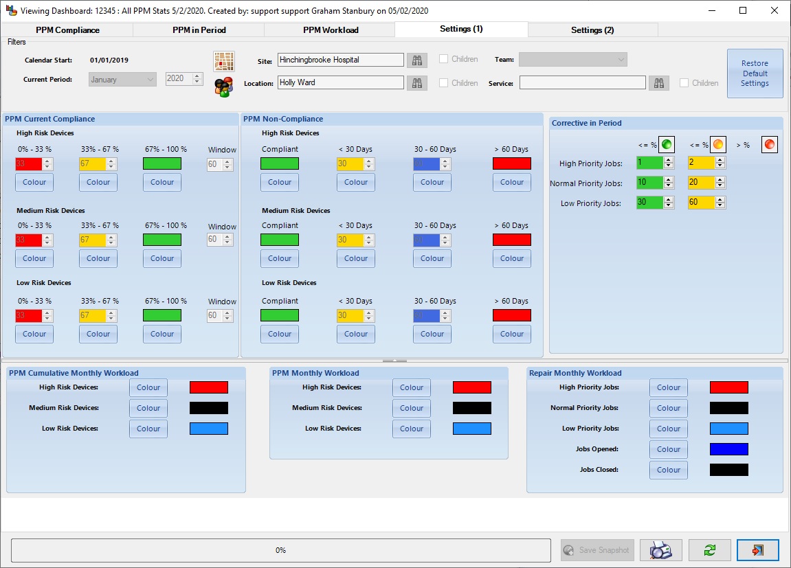
A dashboard snapshot is simply a collection of this dashboard data saved at a particular moment in time. In addition to the underlying data a snapshot also has a code and a name, like almost everything in e-Quip. It also stores all of the parameters that were used to generate it. i.e. all of the filters and parameters on the “Settings (1)“and “Settings (2)” tabs.
Taking a Snapshot
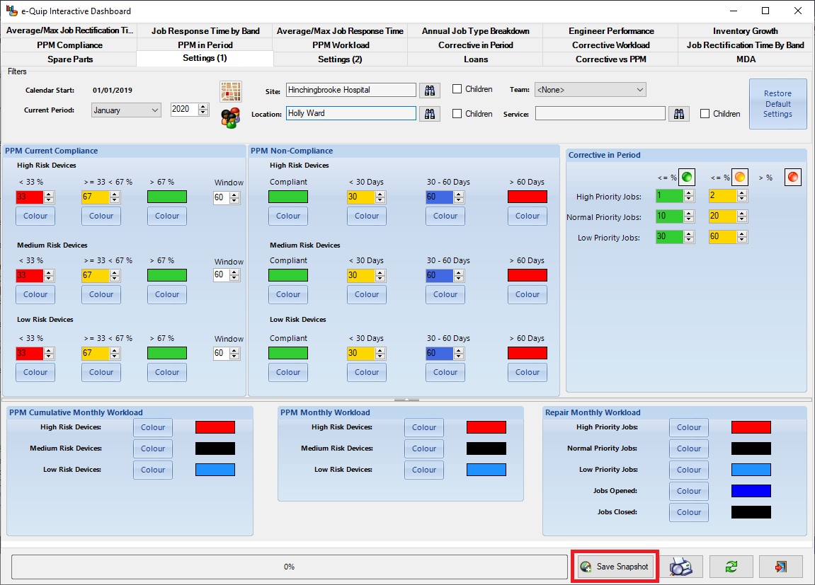
Unsurprisingly, dashboard snapshots are taken from the dashboard.
Note the new button “Save Snapshot” at the bottom.As well as saving the dashboard data, the snapshot will include all of the information on this page, including the calendar start date, current period and all filters.
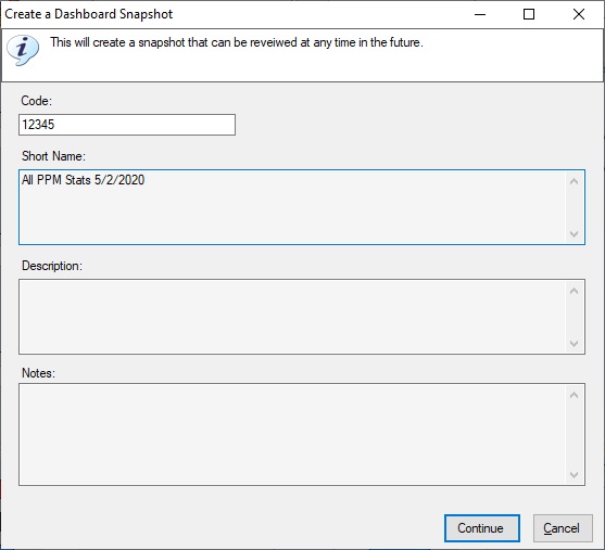
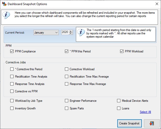
Once you click “Save Snapshot” you will be asked to provide a name for the snapshot and then you can choose which information should appear in it.
(Oops! I have just spotted the typo in the screen above)
That’s all there is to it.
Viewing a Snapshot
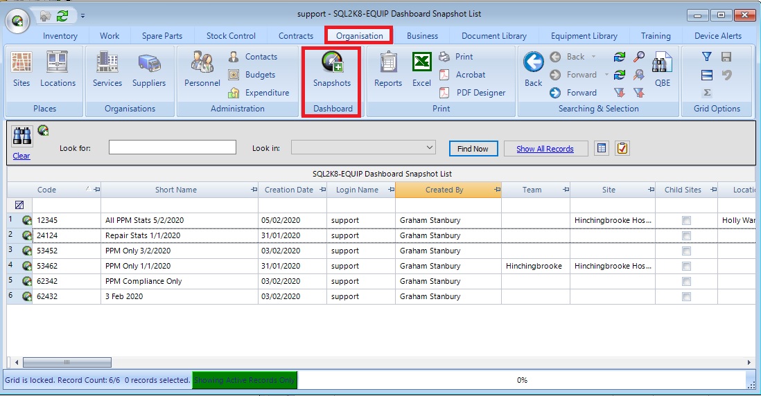
Where do snapshots go once you have saved them? This might change if we can think of anywhere more appropriate for them, but at the moment you can find them here (under Organisation / Dashboard):
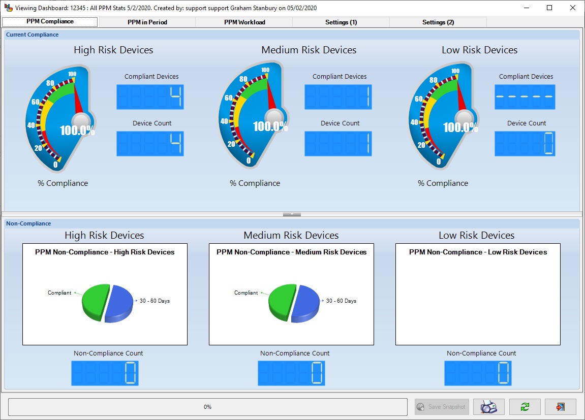
To view a snapshot, just double-click on it. The dashboard will appear and show the data.
Notice that:
- The dashboard only shows the tabs for the data in the snapshot
- The filters, dates and parameters are restored from the snapshot
- The Save Snapshot button is disabled
You can now view the dashboard as it originally appeared when the snapshot was saved.
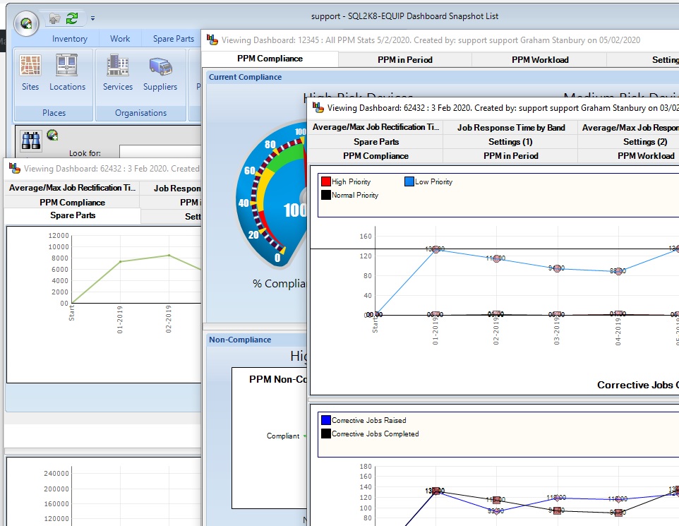
Naturally, you can view as many snapshots at the same time as you like.
You can export a snapshot to PDF although it can obviously only include data that is actually in the snapshot.
What Can’t you do in a Snapshot
Refresh
You can’t refresh a snapshot – it’s a snapshot.
Filters & Parameters
You can’t change the filters or parameters that are used by the snapshot. Remember that the snapshot saves the actual KPI data, not how it was originally calculated. However, you can change the colours. Indeed, when a snapshot is opened your personal preferences are used for these, rather than the preferences of the person who saved the snapshot.
Navigation
Normally you can double-click on any graph, chart, gauge etc., in the dashboard and this will navigate you to the appropriate data. i.e. If a gauge indicates that there are 100 non-compliant high-risk devices then double-clicking on that gauge will show you those 100 devices.
This isn’t possible in a snapshot. This would involve determining which devices were non-compliant on the date that the snapshot was taken. If we could do that, we wouldn’t need snapshots in the first place!
Automated Snapshots
It is possible to automate the snapshot procedure so that snapshots are taken at predetermined intervals, so you don’t have to remember to create snapshots manually.
The Training Dashboard
We plan to be including dashboard snapshots in the spring 2020 release. They are not available yet for the Training Dashboard but depending on the feedback that we get we should be adding this feature fairly soon.
As always, all feedback is welcomed.
