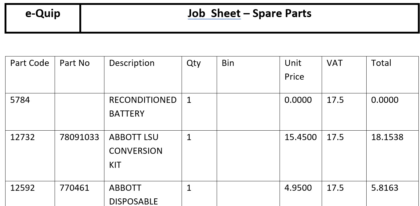
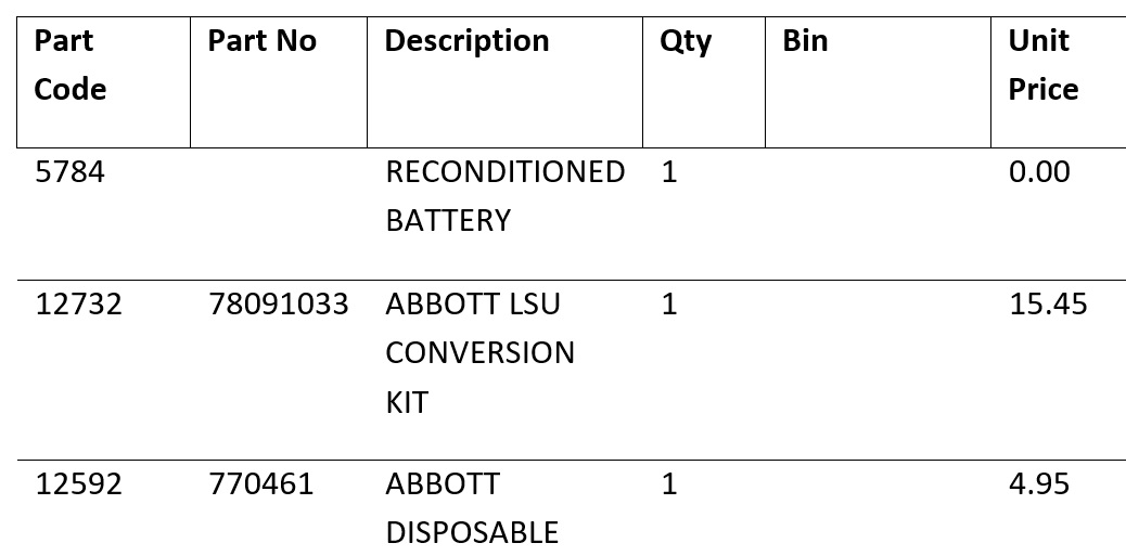
You probably know that you can design your own Microsoft Word reports for things like job sheets, invoices, equipment bar codes etc., but you might not know how you can control the format of sub-lists, like the list of parts used on a job. e-Quip ships with several sample reports which you can use to design your own versions. The standard parts list on a job sheet looks like:
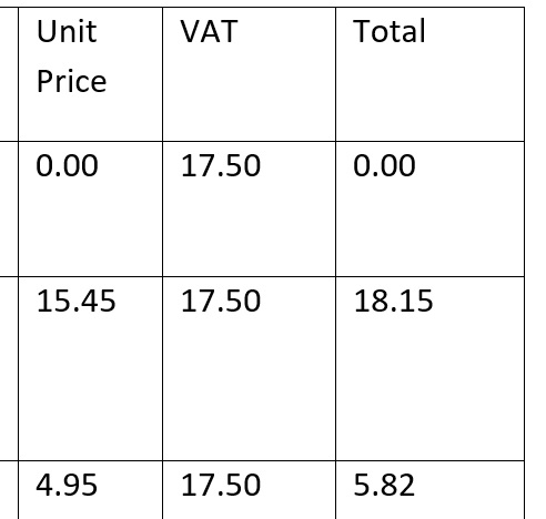
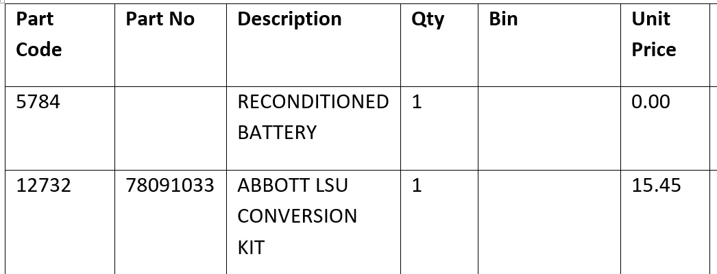
I’ll go out on a limb here and guess that that probably isn’t exactly what you’re after! There are a couple of obvious points that we can get out of the way first and these are the number formats. Just put a “$” at the end of the mail merge tag in the report and the values will be formatted as currency:
Changing the mail merge tags like so …
… gives the results below.
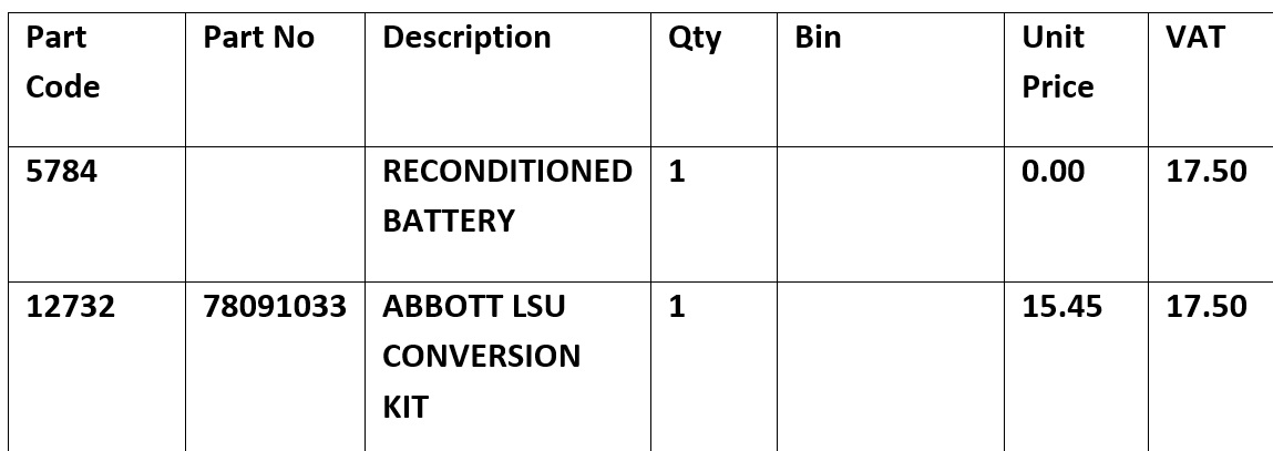
That’s a little bit better. How about making the headings bold. Edit the template …
Er… That’s not we had in mind.
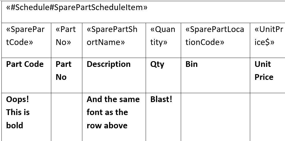
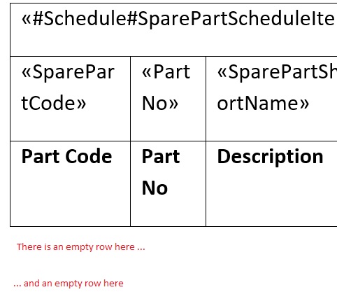
The table in the Word template has 3 rows. The first tells e-Quip which sub-list you are referring to. “#SparePartScheduleItem” identifies this as the parts list (or schedule) for the job. As soon as e-Quip reads this row it knows what to do, so deletes the row.The second row tells e-Quip which columns you want to appear in your report. e-Quip saves these in memory and then deletes that row as well. It remembers any format characters (like “$”) so that it can format the data later. The third row contains your column headings. e-Quip doesn’t touch this row.
So, we now have a table with 1 row containing the headings and a bunch of data that e-Quip has read from the database. The next thing e-Quip does is to add a row to the table. Whenever you add a row to a table in Word, the formatting from the row above is applied to the new row. Try typing directly into the Word template in a new row:
The same thing is happening with the table outlines – these are being copied from the headings row. How about if we added a blank row and set that to bold instead?
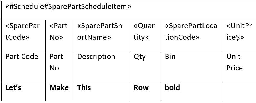
I’ve put some text into the row (“Let’s make this row bold”) so you can see what I’m doing. The results are:
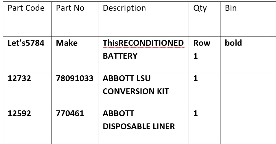
You can see that the new row has been used as the basis for all of the rows added to the grid, along with “Let’s make this row bold” merged with the first row. We’re on the right track. This time, let’s make the headings bold and add another row which isn’t.
This time I haven’t typed in any text but you can see that there is another row in the table. I have changed the font for it so that it isn’t bold.
Now we’re getting somewhere. Let’s get rid of the horrible border.
This results in:
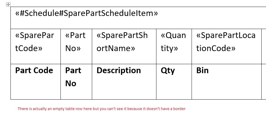
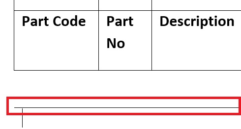
How come? The first blank row in the table does actually have a border – it’s the bottom border of the row above it. i.e. the headings row. You would see this in Word if you added a new row to the table and started typing.
Let’s add another blank row without any border.
This is a bit more like what we need.
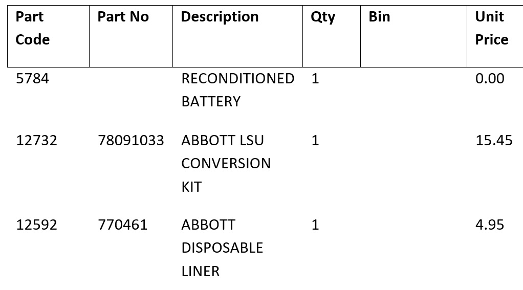
A bit more final tweaking (get rid of the 10 point space that Word is putting after each row and make the table landscape) gives:
This technique also means that you can have different fonts and colours for the headings and data.
I hope you find this useful.
